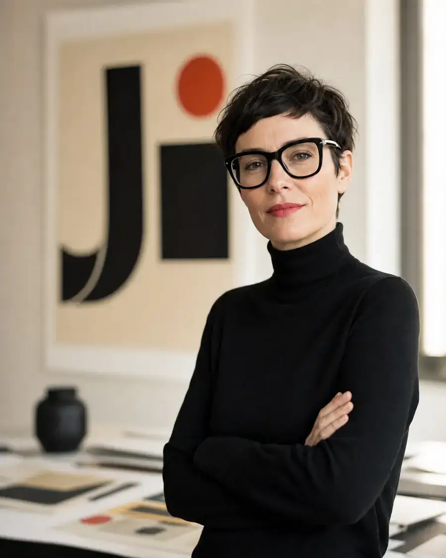
Identity programs for cultural clients — museums, festivals, studios — where the mark has to behave as well as look. Built as systems, not pictures.
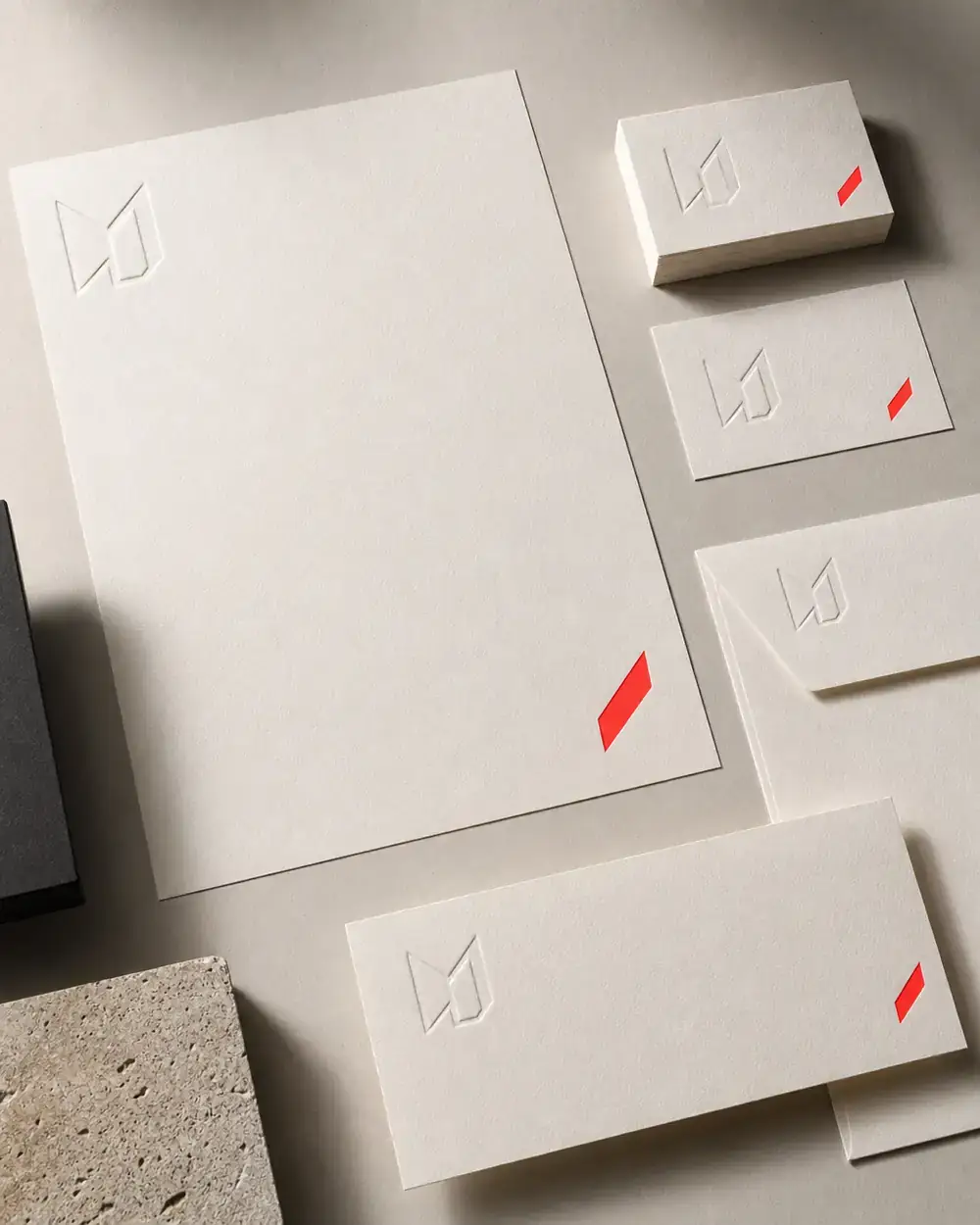
A logo that can't move is a corpse. Every identity here ships with a living mark: a construction rule, a motion, a failure mode. The monogram opposite draws itself in — stroke by stroke — every time it's seen.
Client: Kunsthal Nord · Nieuwe Muziek Festival · Atelier Riet
Monogram · MV
Badge · Kunsthal Nord
Wordmark · festival
02 / Packaging
Unpacking Things.
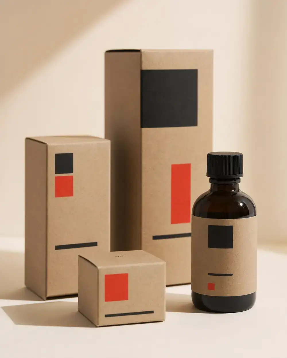
Sustainable packaging systems for food, cosmetics and objects — designed to be opened, reused and remembered. Structure as branding.
The box is the first sentence of the product. These systems replace one-way packaging with a typographic language that survives the unboxing — die-cut, mono-ink, and printed on paper that wants to be reused.
Client: Bruto Foods · Lumen Skincare · Øst Coffee
03 / Posters
Posters for the Public.
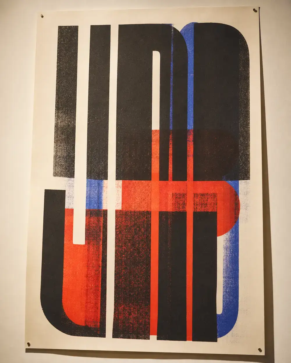
A risograph poster series for concerts, exhibitions and city events — set loud, printed in layers, posted on the street where they belong.
No screens. No gloss. Two inks, one misregistration, and a headline big enough to read from a tram. The series is collected by the municipal archive — the highest compliment a street poster can get.
Client: Het Stedelijk · Night of the Arts · DIY print run 500
04 / Type design
Letters with Opinions.
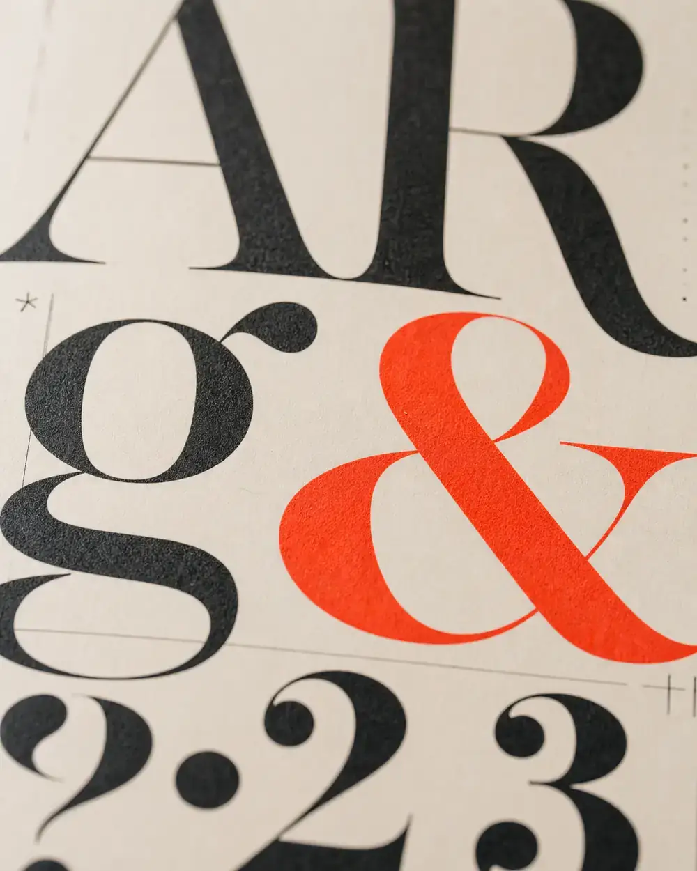
Three original typefaces — a grotesk, a serif and a mono — drawn for specific voices. Each ships with a full specimen, free to download below.
Type is design's raw material. These faces began as answers to specific briefs — a festival that needed to shout, a book series that needed to whisper — and became families.
Voss Grotesk · Maya Serif · Ink Mono — all under SIL Open Font License
Type specimens
Drag. Pinch. Read.
The specimens below are live — grab them and move them around, pinch (or scroll) to set the size. The full PDF is one click away.